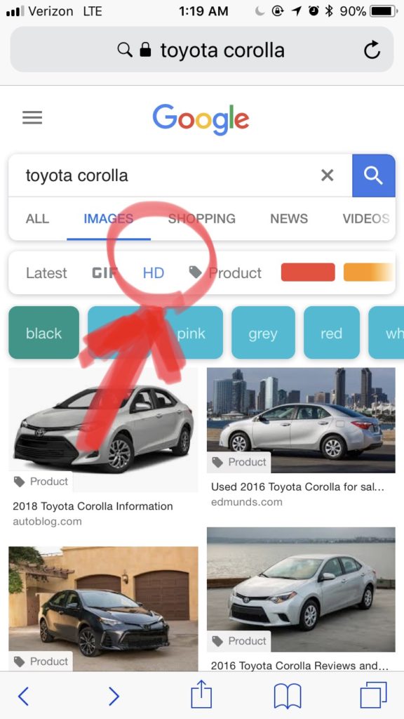
HD images on Google, VDP complaints, and how that ends on my view of automotive online buying: Google just added ‘HD photos only’ search to the image search category, yet they continue to use “scare tactics” while claiming ridiculous speeds for load times needed for small businesses. (Please note that I say “small businesses” because Nike, Amazon, eBay, or Google itself haven’t made note of the speed test tools time references and have not made their sites any faster. They all fail this absurdity).
The fastest ways to make your website faster (quote me on that!) are to reduce the number of graphics on the site, to reduce the number of consumer tools per page (code, data recalls, etc), or to reduce the graphics quality by graphics size or pixelation (smaller graphics weight).
All these options have one thing in common: They affect the consumer experience on the site. Google claims that faster speeds increase positive experience (a view not shared by the companies I mentioned above) but no one mentions what is the experience lost by decreasing options and quality. Obviously Carvana.com didn’t agree with that and decided to follow Google’s mobile image search lead and provide a VDP that is product-centric first, with high resolution images on the desktop version. I believe that Google’s speed test should be used to measure redundancies in the pages like:
- Do you need a map on that page?
- Do you need 5 CTAs that link to the exactly same form?
- How much code is recalling external data?
- Etc.
To my [self-serving] point, we launched a project a few months ago (for which I must thank Georald Camposano, Steven Warren, and Sam Vukas) so we can drive dSLR camera high resolution images to the VDP and have built a full screen vehicle view VDP. Our goal was a better customer experience from a product point of view.
Joe Gillespie said in a meeting that “for all we talk about Amazon, be like Amazon, look what Amazon does, we continue to build websites that focus on lead generation yet we don’t send leads to Amazon!”
For years we have built websites that served our goals: to generate a lead. Period. From the position the vehicle pointed to, to the SRP/VDP flow, to the CTAs color, position, names, etc. We decided to build our newest SRP like a VDP used to be; a 640×480 image, scrollable images (a first I believe), dealer comment, a group of data (options), pricing structure, and a set of CTAs. Since you can do VDP stuff in the SRP, here is the biggest change. With how hard it is to bring customers to the VDP, make it the landing place to truly experience the vehicle by:
- Creating a VDP without CTA obstructions (background) that focuses 100% on the product (vehicle), and that uses all available media technology (high definition images, hot spots, video, 360, and panoramas).
- Focusing the VDP to bring the most of the product experience to the consumer via the computer to leave no questions or doubts.
- If the customer has every piece of possible data, they have every view imaginable where they can see all fine details and/or imperfections. Where there is interaction with videos, expanding images, and immersive 360, the only possible following step is to discard this vehicle if it didn’t satisfy our needs or to start the buying process online.
This is why I believe that online vehicle buying will start not with a better form connected to a bank nor with a faster loading, thin page but when the customer has total access to the vehicle and there are no questions left: This is my car. If you want to see more about our new high definition image VDP with hotspots, videos, and 360, as well as our online buying system, come visit at NADA March 23-25 in Las Vegas.

Yago de Artaza Páramo [email protected]